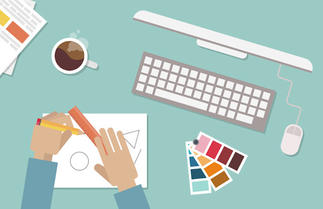
Rarely do we stop and think about how we see graphic design
all around us, every day. Every advertisement, brand logo, those are
all designs that impact us. Some designs stand out more than the rest.
They grab your attention and hold it. The goal for any graphic designer
is to captivate and inform the viewer. There are a few ways to help
assure that your designs will be successful. Let's take a look at what
can assist you in making a top notch design and what to watch out for to
avoid putting off your audience.
DO look around and see what’s out there in the
design world. What’s “hot” right now? Checking out what other designers
are doing is a great way to get inspired!
DON'T steal work from other designers. Just like
you, these people have gone through a dry spell. They also have worked
really hard to get out of it and put out an excellent product.
DO use clean and modern fonts so that your typeface is easy to read.
DON'T use too many fonts in one design. The viewer
may lose interest or get overwhelmed if the design is flooded with a
mess of fonts.
DO venture into using more stylized fonts. Maybe
you’re looking to have a more funky design or a clean font may not go
well with the message you are trying to get across.
DON'T use comic sans or crazy fonts that end up
being hard to read. Remember you are a designer and you want to be taken
seriously. You are not a third grader trying to make a “Keep Out” sign
for your clubhouse.
DO implement images into your design. The image can stand out in most cases and will grab the attention of the passerby.
DON'T overload your design with too many images. You
want to make sure your design is conveying a clear message and you
aren't taking away from the message with a multitude of images.
DO use stock photos. There are tons of websites out
there that have an image for anything you can think of. Some websites
such as shutterstock.com offer a pay as you go option if you don’t want
to shell out a ton of money for a subscription.
DON'T use Google images! First off, you don’t own
the rights to those images. Second, often times the images aren’t that
great of quality. You want to make sure you have a professional looking
image that you can alter and resize without pixelation.
DO take time to choose your color scheme. Giving the
colors the attention they need will serve you well. Are you unsure
about a color scheme or need some additional inspiration?
You can use Google to search “color schemes” and find a library of
results that will help you see a variety of different colors working
together. You can also flip through magazine pages or promotional
materials laying around and use those as reference materials for color
combinations.
DON'T slap colors together that don’t make sense
with the type of piece you are designing. Different colors spark
different emotions in people. So it is important to pay attention to
what emotions the colors you are using give off. For example, if you are
creating an ad for a company's event with an Autumn theme, you wouldn’t
use a color scheme consisting of pink and green pastels. That would
give off a spring vibe rather than a fall vibe.
DO pay attention to how much white space is between
your letters. You want to make sure that the words are easily readable
so the view can understand the message.
DON'T space your letters so far apart that you
almost could fit another letter in between. On the other end of the
spectrum, don’t make your letters so close together that the word could
be mistaken for something else. If you are using kerning to take up
space, look for an alternative such as making the font a larger size.
DO remember that you’re the designer, not your
client. That is why they are hiring you. It is important to get clear
details from your client on what they want in the design and what is
expected of you. However, it is also important for the both of you to
understand that the end goal needs to be realistic for the both of you.
Designs become iconic and memorable, they are not created that way.
DON'T have a negative attitude while working with a
client. They hired you and if they don’t like your attitude, they don’t
have to keep you. Keep in mind that word of mouth is the best form of
advertising. You want to make sure that every client you work with has a
pleasant experience.
We hope that this list has helped you improve your graphic design skills.